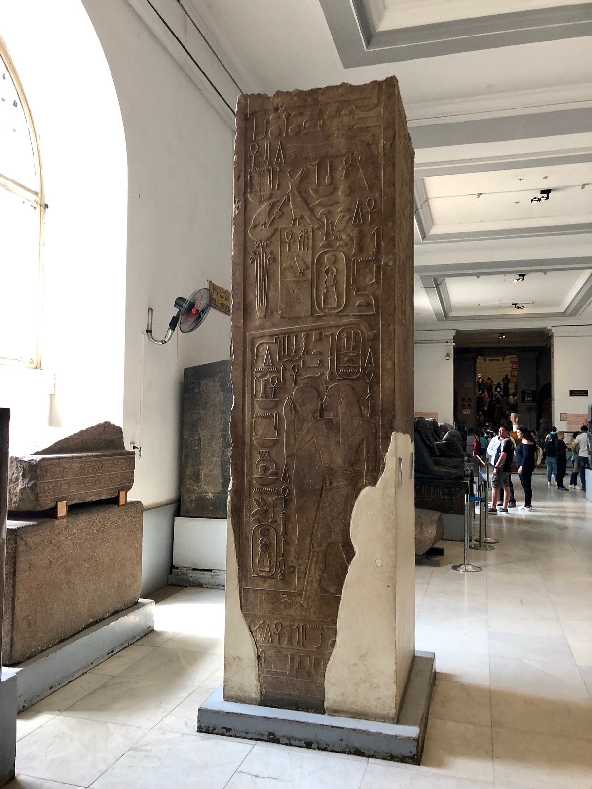
You do not need to translate an inscription to notice how writing works as an object. Signs occupy surfaces, establish direction, divide space and identify who was expected to read, recite or simply encounter them.
Begin with location on the object
Find the writing before trying to decode it. Does it run around a vessel, descend a pillar, frame a figure or occupy a manuscript page? Text placed beneath feet, behind a body or high on a wall creates a different relation from a label-like caption beside a face. The position can indicate sequence, ownership, dedication, protection or architectural integration, but observation should come before interpretation.
Find direction through the signs
Hieroglyphic signs can be arranged in rows or columns and can face in different directions. Human and animal figures often help establish where a line begins: readers generally move toward the faces. Do not turn this into a speed-decoding trick. First notice whether the direction changes inside a larger composition and how text meets images. A figure and inscription may face one another, creating a visual exchange.
Compare scale and density
Large, widely spaced signs can operate architecturally, while tiny, dense writing demands close attention or specialized access. On a manuscript page, margins, headings, rubrication and image placement create hierarchy before individual words are understood. Ask who could physically reach or see the text. Some inscriptions addressed divine or funerary settings rather than a crowd of ordinary readers.
Treat the support as part of the text
Stone, wood, ceramic, metal, papyrus, parchment and textile offer different surfaces and constraints. Cutting a durable inscription is not the same action as writing ink on a prepared sheet. Curvature changes line length; a joint may interrupt a sequence; damage may remove the beginning of a name. The writing surface records resources, tools and skilled coordination.
Look for change, correction and reuse
A recut name, erased figure, added line or reused architectural block can reveal a second history. Not every irregularity is an intentional political alteration, so follow the museum's evidence. Differences in depth, alignment, surface colour and tool mark may help, but conservation and lighting also affect appearance. Uncertainty is more accurate than turning every damaged text into a dramatic story.
Move beyond hieroglyphs
Egyptian museum collections include many writing traditions and languages. Coptic and Islamic collections make manuscript production, calligraphy, administration and devotional reading visible across later periods. Compare how script shares space with ornament and image. A trip focused only on hieroglyphs misses the long history of readers, scribes and book makers in Egypt.
Treat names and titles as relationships
When a label translates a personal name or office, do not stop at identification. Ask what the title connects the named person to: a temple, household, ruler, workshop, military role or administrative task. Repeated titles can reveal institutions; family relationships can explain memory and succession. The inscription makes a social position visible, but the object's location and audience determine who could encounter that claim.
Read the museum label as a second text
The modern label selects a translation, date and interpretation from a larger field of evidence. Notice cautious words such as “probably,” “attributed” and “possibly.” They mark the boundary between observation and scholarly reconstruction. Compare what you saw physically with what the label emphasizes. If it supplies a translation but says little about placement or support, your close-looking notes can restore the inscription's material conditions without pretending to replace specialist knowledge.
Sources reviewed 28 July 2026: Coptic Museum profile ↗ · Museum of Islamic Art ↗. Galleries and visitor conditions may change.